The Understated Genius of Saul Leiter

Saul Leiter – An Unfinished World

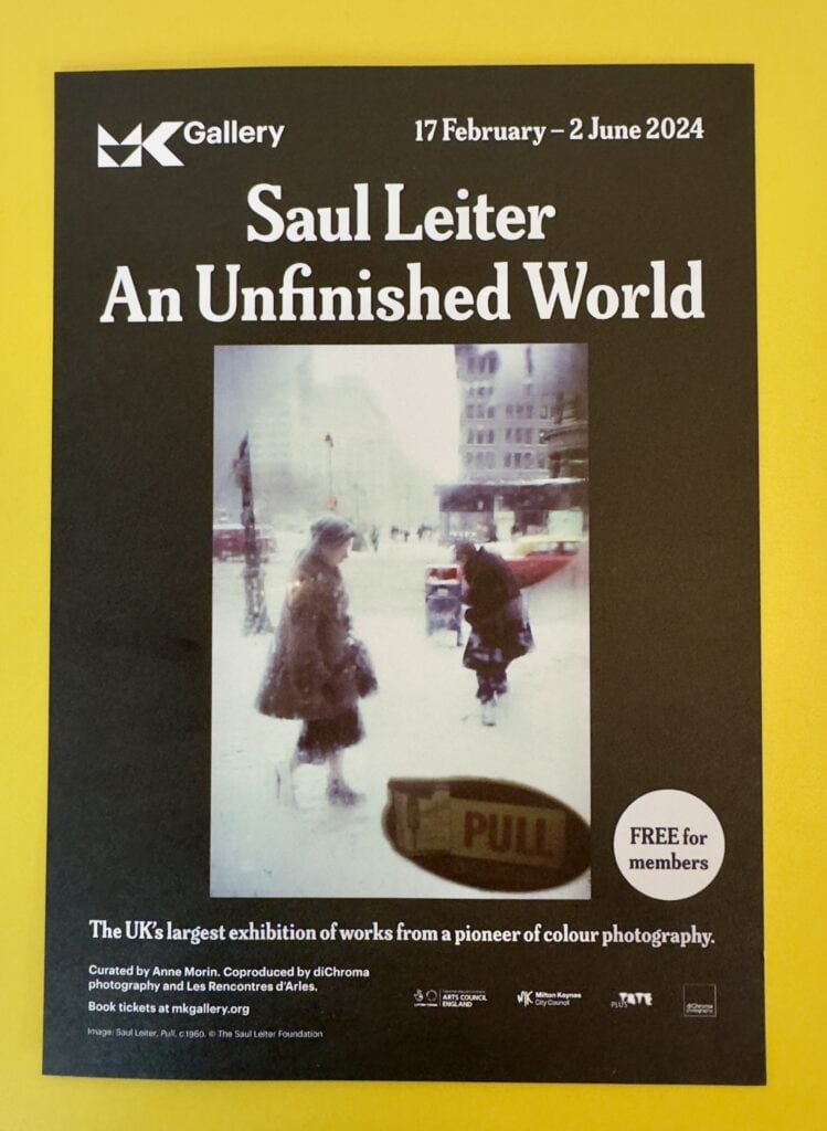
I have long enjoyed the photography of Saul Leiter and my admiration for his work was increased by visiting the “Saul Leiter: An Unfinished World” exhibition at MK Gallery, curated by Anne Morin.

Saul Leiter
A flyer for the exhibition shot on a bright yellow table at the MK Gallery

This exhibition mixes Saul Leiter’s colour and black and white photographs, paintings and commercial fashion photography. There is a comprehensive chronology printed on the wall but the exhibition “encourages encourages viewers to find their own relationships and paths through Leiter’s unfinished world.” Given Leiter’s work and the world-view that underpins it, this approach makes a lot of sense.

The title is equally apposite and befits a collection of ‘tiny fragments of an unfinished world’. This was his world view, “little pieces of images juxtaposed and conjoined, to form ever-expanding fields.”

Many of Leiter’s pithy quotes adorn the walls, which I found both helpful and inspiring. All in all, it is a fine and very worthwhile exhibition. A review in the Guardian called it a “glorious survey of an impressionist with a camera.” I completely agree with that assessment, but the exhibition unlocked something I didn’t expect – an encounter with the person behind the lens. To my great surprise I found Saul Leiter the person as inspiring as his work.

The Photography of Saul Leiter

Saul Leiter had no formal training in photography, but the genius of his work was recognised by the influential Edward Steichen, who included it in two important MoMA shows in the 1950s.

Leiter’s work is characterised by abstract form and bold composition. He did a great deal of very fine black and white work which makes much use of much shadow and blur, and I enjoyed it greatly. However, it is his colour slide photography that has had most impact on me.

I like it when one is not certain of what one sees. When we do not know why we are looking at it, all of a sudden, we discover something that we start seeing. I like this confusion.

The experience Leiter describes here is often that of the viewer of his photography. There are large expanses of negative space, sometimes enveloping a detail; abstract lines that resemble brush strokes; reflections, fogged glass; fog; shadows and silhouettes. Much of street photography has a documentary feel but Leiter’s takes it to another more abstract, impressionist dimension.

He often makes use of steamed up windows for their abstracting quality, uses snow as a flat white backdrop and blurs foreground objects . He sometimes used expired colour film, which could produce surprise colour shifts.

Street photography depends greatly upon chance encounters, but as the Guardian review of the exhibition noted, “He finds chance and arbitrariness because he is looking for these things, and uses all his artistry to bring them out.”

He has other recurring themes. In addition to the inclement weather, translucent materials and properties of light that help him him gently smear his palette he regularly returns to cars, buses, hats and famously, umbrellas.

Painterly Parallels

His work is painterly, with fans and critics seeing parallels to the work of great artists like Edward Hopper, Piet Mondrian and Mark Rothko. The parallel with Hopper strikes a chord with me. I have seen some of Hoppers’ work, most notably, Nighthawks, in The Art Institute of Chicago. There are similarities in both the colour palette and the emotional undercurrent, though it occurs to me that Leiter’s urban experience is more about introversion than the isolation Hopper is known for.

Art critic Roberta Smith wrote in 2005: “Mr. Leiter was a photographer less of people than of perception itself. His painter’s instincts served him well in his emphasis on surface, spatial ambiguity and a lush, carefully calibrated palette.”

Harlem, 1960

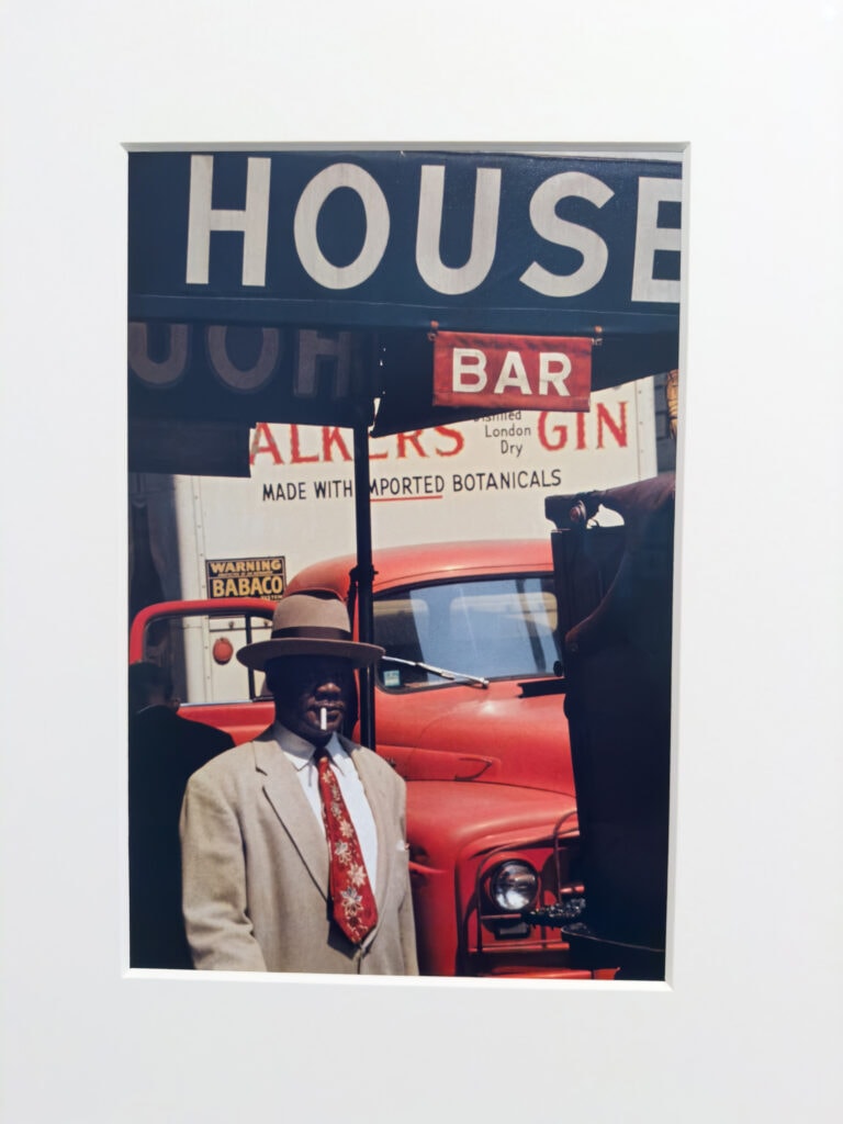
One of the photographs that impressed me the most at the exhibition was one of his most famous photographs: Harlem, 1960. There is great description of the image in The arts desk: “A black man in a panama hat and beige jacket smokes a cigarette as he walks under the black awning outside a bar. There’s nothing to this chance encounter with a passer-by, except for an amazing synchronicity of colour. The man’s beige jacket matches the lettering on the awning announcing HOUSE, while his tie matches the red cab of the lorry parked behind him and the lettering on the vehicle advertising Walker’s Gin. A man in a black coat walking the other way frames the left side of the picture while a black dustbin frames the right side. The coup de grâce is the beige and red sign overhead that reads BAR and completes the colour composition.

Saul Leiter
Harlem, 1960 by Saul Leiter

If this were a painting by Whistler, the image might be called Harmony in Beige, White, Red and Black and it would have been artfully contrived. Leiter’s photograph, on the other hand, was completely unplanned. “I’ve never had a system or a project,” he insisted. “I don’t go out looking for things. I wander around with my camera, like a flâneur.” The paradox is that he responded to “unimportant things” spotted en passant, yet the viewer often has to spend time unravelling this split second of information.

The Unseen Saul Leiter

Much of his colour work was taken on slides. This enabled Leiter to project his photographs on the walls of his apartment, which was important to him as he couldn’t afford to have prints made at the time.

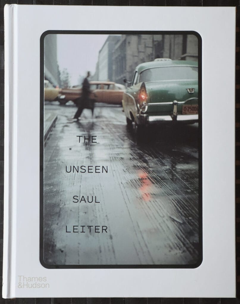
The MK Gallery bookshop had a copy of The Unseen Saul Leiter, which is a book of 76 Colour slides with several chapters of commentary. Most of the slides are Kodachrome, but some are Anscochrome or Ektachrome.  The images were taken mostly in the years 1948 to 1966, Saul’s first two decades of living and photographing in New York.

The book is important as, until it was published, the majority of Leiter’s images known to the public were those published in Early Colour, which largely introduced his extraordinary talent.

The origins of The Unseen book were an academic project. In 2017 the German scholar Elena Skarke approached the Saul Leiter Foundation because she wanted to write her dissertation on his work. She visited his studio (now the foundation’s headquarters) and decided to focus on the colour transparencies for her research.

Saul Leiter
My copy of The Unseen Saul Leiter, resting on a black bamboo table mat

The Unrecognised Pioneer of Colour

Saul Leiter was a pioneer in the use of colour photography. In the 1940s, when black and white photography was the norm for serious work he embraced colour, which he used in a completely unique way, often using a 150 mm telephoto lens in his colour street photography, the compressed view contributing to provided the painterly feel.

Colour Photography in the 1940s

At that time colour photography was the realm of ads and amateurs. Walker Evans, the famed documentary photographer of the great depression called colour photography “vulgar,” and he was far from alone in this sentiment.

One day I bought a roll of colour film and I took pictures. Then I got a small box with slides. I liked what I saw. I liked colour even though many photographers looked down on colour or felt it was superficial or shallow. – Saul Leiter

Colour Photography in the 1970s

The recognised pioneers of colour photography were William Eggleston, Helen Levitt and Stephen Shore, who gained recognition much earlier than Saul Leiter, becoming famous advocates for the medium in the 1970s. Sadly, Leiter barely made a footnote at that time.

For many years William Eggleston was recognised as the first photographer to use colour as a defining artistic choice. Happily that that view is fading and Leiter is getting the recognition he deserves – along with a better sense of perspective. After all, Alfred Stieglitz made and exhibited colour photographs using the Autochrome process in 1909.

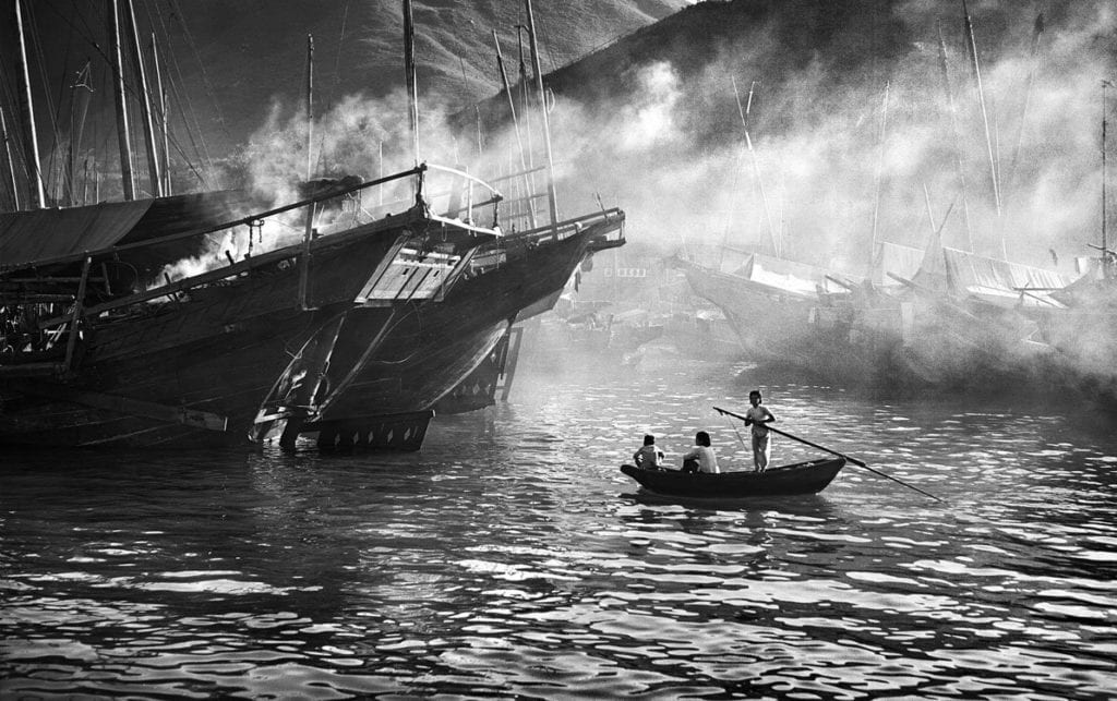
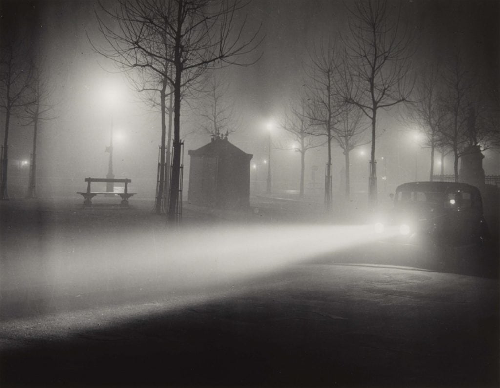
Whilst I respect the work of all of those photographers, it has not had the same impact on me as Saul Leiter’s. He is in that very small group of photographers for me whose work is arresting in the true sense of the word – it stops you in your tracks. A few of those photographers have articles of their own on this site, including Cindy Sherman, Vivian Meyer, William Klein, Fan Ho and Brassaï.

Perhaps being left alone in relative obscurity helped him develop his unique and introspective world view. Geoff Dyer, in a review of his work in the Telegraph asked what it meant to be an ignored artist and asserted that “For Leiter – left alone to his colourful craft – it was the making of a master lensman.”

Zen Saul

Leiter was a thoughtful man with diverse influences. His library consisted of thousands of books and he was influenced by Japanese woodblocks and ink paintings as well as impressionist and post-impressionist painters.

During the research I conducted after the exhibition I came across an article by freelance photographer Belinda Jiao entitled Saul Leiter Street Photography Analysis: Techniques, Influences, Philosophy which shed more light on the influence of Japanese culture.

Love of Japan

I learned that he loved all things Japanese, which is a passion I share with him. The Ten Days In Japan I had in 2015 were wonderful. Belinda provides an illuminating quote from Pauline Vermare, the curator of the exhibition Photographer Saul Leiter: A Retrospective: there were etchings of paintings by Koryusai hung on his wall; among the heaps of collected items were Japanese calligraphy papers, vinyl records of Japanese musicals, and a massive library of books dedicated to Japanese literature, poetry, ceramics, ukiyo-e and Zen.

The same article describes the strong parallels between Leiter’s work and Zen Buddhism, which celebrates the living in the moment yet without attachment to earthly pleasures. It is also a shared characteristic also commonly found in Japanese ukiyo-e (translates into ‘Pictures of the Floating World’) prints, which has a strong emphasis on depicting the here-and-now, the banal fragments of being human.

The article also pointed out the correlation between Leiter’s choice of subject matter and those that feature regularly in ukiyo-e art – everyday life objects and elements of weather.

Although Leiter rejected the notion that he had a philosophy at all, the more you examine his work and its influences the more you appreciate his depth.

I don’t have a philosophy. I have a camera.

Increasingly, I wonder if that quote is accurate, or whether it is just a reflection of Leiter’s lack of ego.

The Prophets – Impressionism & Les Nabis

Saul Leiter’s biggest influences in the art world were the post-impressionist artists Pierre Bonnard and Édouard Vuillard, who were both members of ‘Les Nabis’, which means ‘the prophets’ in Hebrew. This was a movement that embraced bold colours, flattened and abnormal perspectives, combining late-Impressionism’s focus on light, Japanese-influenced lines, and Paul Gauguin’s striking use of colour.

The Cameras of Saul Leiter

It seems almost wrong to concern ourselves with the more mechanical aspect of his work, but to translate East Village light into the magic of his images Saul Leiter needed optics.

Leiter experimented with colour photography used slide film such as Kodachrome; he also enjoyed using expired film stock with its surprising and odd shifts in colour and his unusual perspectives often come from the use of telephoto lens. These are probably the most salient technical factors in his work. The cameras themselves tell us less, but I am always curious about which makes and models the great photographers used. We learn this from these entries in the timeline from the Unfinished World Exhibition:

1939 c. Is given a Detrola camera by his mother.

1948 Begins working with colour slide film. Works primarily with: Argus C3, Auto Granflex Junior, Leica and an early Rolleiflex.

1960-80 – Continues to do fashion photography which is published in Harper’s Bazaar, Elle, Show, Vogue (UK), Queen and Nova. Photographs are also included in Life, US Camera, Photography Annual and Infinity. Travels to Mexico, France, Italy and Israel. Often uses a Leica M4 for commercial work in the 1970s and after; for street photography uses Leica CL, Minox 35EL and Canon A-1 and AE-1, among others.

2003 – Receives a grant of $10,000 from Olympus along with his first digital camera, an Olympus E-1. Proceeds to purchase many digital cameras including Leica and Lumix models.

By 2005 Leiter had taken his last shot on film, ending a sixty-year relationship and turned full time to digital photography, which he embraced with great enthusiasm.

Painting

Saul Leiter painted daily from his mid teens years until his death. In his formative years abstract expressionism was large and expansive, but Leiter’s paintings, which are most water-colours, are much smaller in scale. I found them interesting but they didn’t move me in the way his photography does.

His friend, the painter Franz Kline, once said to him: ‘If only you painted big, you’d be one of the boys.

Early Life

Saul Leiter (1923–2013) was born into an Orthodox Jewish family, Leiter set out to become a Rabbi like his father but in 1946 he defied this family’s expectations and abandoned his studies. His interest in art led him to move to New York City in 1946, where he pursued painting and photography. His mother had given him a Detrola camera as a child, not knowing the instrument would help reshape his life

I got fed up with the whole religious world and all the preoccupations with purity and nobility and observance—I wanted to be free of those things.

In those formative years, eminent photojournalist W. Eugene Smith and abstract expressionist artist Richard Pousette-Dart (founder of the New York School of painting) encouraged Saul to pursue photography. It was through his friendship with Pousette-Dart that he recognised the creative potential of photography.

Fashion Photographer

His friends encouraged him to take up photography as a way to earn a living and he became a successful fashion photographer, with commissions for Harper’s Bazaar, Vogue and Elle. Leiter’s fashion photography paralleled his personal work, imbued with his unique style – he photographed models soft-focused or behind glass.

I started out as a fashion photographer. One cannot say that I was successful but there was enough work to keep me busy. I collaborated with Harper’s Bazaar and other magazines. I had work and I made a living. At the same time, I took my own photographs.

He preferred shooting in his home neighbourhood of New York’s East Village, where the vibrancy of the streets provided all he needed.

I take photographs in my neighbourhood. I think that mysterious things happen in familiar places. We don’t always need to run to the other end of the world.

Leiter never for self promotion or networking, and with little work and debts mounting in 1980s, he was forced to sell his Fifth Avenue studio. He continued his personal work from his East Village apartment, which he shared with artist Soames Bantry, his longtime partner who often sat for his photographs and paintings, and who died in 2002.

Recognition and The New York School

Although Edward Steichen exhibited some of Saul Leiter’s colour photographs at the Museum of Modern Art in 1953, for forty years afterwards they remained virtually unknown to the art world.

The concept of the ‘New York street photographer’ was born at the same time Leiter started working in the late-1940s. But Leiter wasn’t swept along by its momentum. He was not a conventional street photographer. He lacked the bleakness of Robert Frank or the knowing irony of William Klein which helped propel the popularity of their work and that label.

Saul Leiter may have faded entirely into obscurity if it weren’t for Richard Avedon, who, in 1992, recommended that his work should be included in the book The New York School: Photographs, 1936–1963. This led to other books and exhibitions.

Except for his inner circle, few saw Leiter’s personal colour work until towards the end of his life. Saul Leiter: Early Colour, a book of street photographs, was published to great acclaim in 2006 only a few years before his death in 2013. The instant success of Early Colour transformed Leiter’s life. His precarious finances improved with the increased print sales that followed the book.

The majority of his work, however was left unprinted, with tens of thousands of negatives and slides stored in boxes at his home.

Outlook

It strikes me that Saul Leiter’s outlook on life was deep but bright. He was introspective and contemplative but also cheerful. This is reflected in his photography, which often captures magic in the everyday. He saw what others didn’t and was upbeat where others weren’t. Though I never met the man, I feel an attachment to him that goes beyond his work.

It is not where it is or what it is that matters but how you see it

I see this world simply. It is a source of endless delight

A photographer’s gift to the viewer is sometimes beauty in the overlooked ordinary

 Photography is about finding things. And painting is different, it’s about making something

Afterword

While I am a photographer who works mainly in black and white I do use colour occasionally. If I am going to produce a colour image I prefer to use film and I have a great affection for the tones of Kodak Portra. Since the light of my encounter with Saul Leiter and his artistry I intend to review my colour work and see where that takes me.

Vivian Maier and The White Bear

It’s hard not be distracted from Vivian Maier’s work by her life. As told in the 2015 documentary Finding Vivian Maier, the extraordinary stories of her life and the discovery of her work have contributed substantially to her posthumous status as a photographic legend.

Taking in the first UK exhibition of her work Vivian Maier: Anthology, in Milton Keynes, I was determined to avoid that.  Vivian Maier’s work demands our full attention. 

As Enigmatic as the Smile of the Mona Lisa

The challenge of admiring Vivian Maier’s work is that her life story is so unusual and her work so deeply entwined in it, that it is extremely difficult not to get lost in it.  Her experimental self portraits, frequently cast in shadow or captured in a reflection, contribute to this challenge.  Sometimes they are playful, often slightly mischievous and occasionally ghostly, but every glimpse draws you into the life of an extraordinary woman.  Her appearance is as enigmatic as the smile of Mona Lisa and it’s hard not be fascinated by her and dwell on her extraordinary story.

The White Bear

Not dwelling on Vivian Maier’s life story when looking at her work is so difficult that it reminds me of the famous test of the white bear.  As a boy, Tolstoy and his friends founded a club with the sole membership requirement of standing in a corner for 30 minutes and not thinking about a white bear.  This is called intentional thought suppression, and it is difficult to achieve. There is a book on the subject: White Bears and Other Unwanted Thoughts.

A Guardian review of Anthology argues that the exhibition of 146 images overcomes this problem, and I agree. ‘The extraordinary life story of the nanny who was secretly a street photographer can overshadow her groundbreaking images – but at the first UK show of her work they take spectacular centre stage’ was Sean O’Hagan’s summary.

The text that greeted me on the wall of the Anthology exhibition by curator Anne Morin described her life in just 75 words. 

Vivian Maier’s work was unknown to most people for the vast majority of her life. While working as a nanny in New York and Chicago for over 40 years, she photographed daily life on the streets. She produced over 140,000 images as well as film and audio recordings. Maier’s work came to light in 2007, just before her death, when her huge archive was auctioned off from a Chicago storage locker due to missed payments.

Vivian Maier: Anthology, Milton Keynes, June-September 2022, curated by Ann Morin

I’ll leave it at that.  Morin’s introduction, captured by my iPhone, then went on to describe her work.

Her images, mostly from the 1950s – 1970s, present a distinctive record of urban America. From carefree children and glamorous housewives to the homeless and poor, Maier’s pictures capture the highs and lows of everyday life. Street scenes with shop fronts, arcades and architectural images play with perspectives and patterns. Smouldering furniture, abandoned toys and tangles of electrical cables set the scene as families, workers and commuters go about their daily business.

Vivian Maier: Anthology, Milton Keynes, June-September 2022, curated by Ann Morin

The Exhibition

Up close to the large prints of the exhibition, Vivian Maier’s work made a huge impression on me.  I am reasonably well versed in the history of photography and have written about several of the greats that stopped me in my tracks: Fan Ho; William Klein;  Brassai and Cindy Sherman amongst them.  Artists sometimes have the same effect. Caravaggio, the original master of dark and light, is one who took my breath away. Maier is one of these – the kind of photographer who inspires you to pore over books of their work (I bought the Thames and Hudson retrospective).

What struck me about Vivian Maier’s work, particularly her square framed black and white street photography, is the unique combination of ‘how did she do that?’ composition, shot making excellence and an extraordinary probing empathy for her subjects.

The strange, rather detached, but still evident humanity that characterises Maier’s street photography work is arresting. In another Guardian review Adrian Seattle concludes with ‘We could talk of a compassionate eye but I’m not sure it helps or even if it is true. It was all the same to Maier and she didn’t flinch or pass by.’ The autobiography Vivian Maier Developed: The Untold Story of the Photographer Nanny by Ann Marks records that Maier was once described as an extraterrestrial by an acquaintance, and I think I understand why.  There’s that white bear again. 

Vivian Maier’s Cameras

Much of the exhibition shows images taken on the iconic 6 x 6 medium format Rolleiflex, for which Maier is most famous. A little online research revealed that, like many photographers of the period, she started out with a simple Kodak Brownie box camera. Maier acquired her first Rolleiflex in the early 50’s and over the course of her career used a Rolleiflex 3.5T, Rolleiflex 3.5F, Rolleiflex 2.8C and a Rolleiflex Automat.  The Rolleiflex is solidly made and weighty, with the 3.5F tipping the scales at over 1.2 Kg.

Vivian Maier
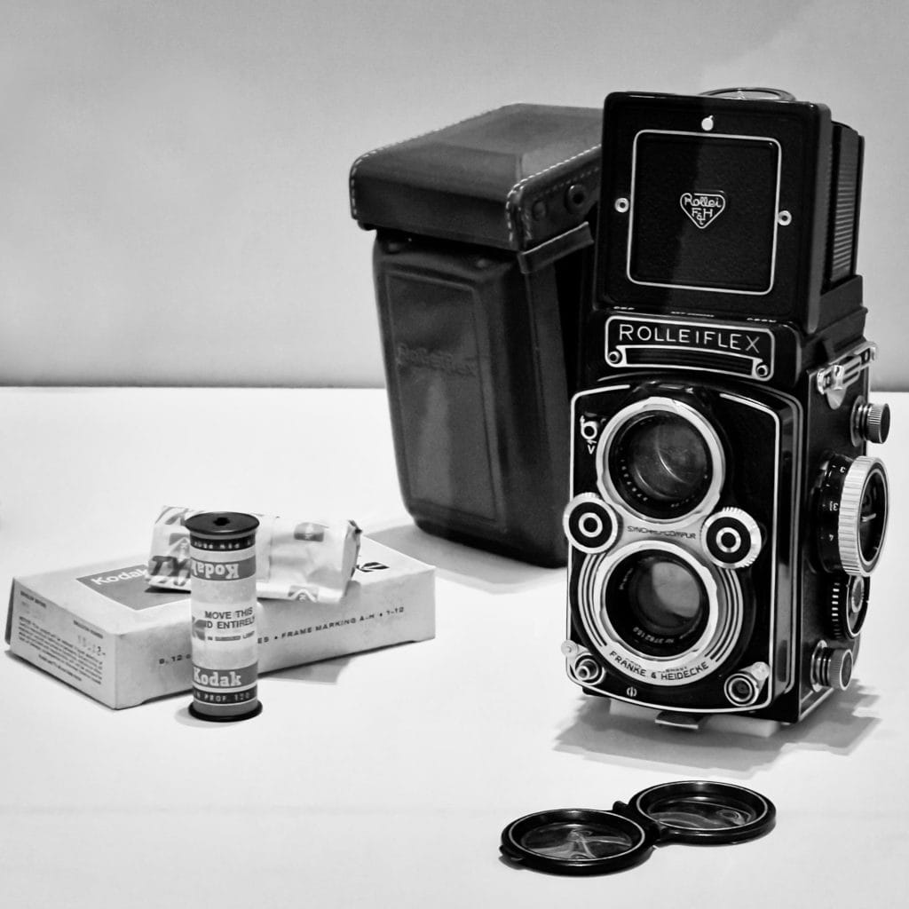
A Rolleiflex Twin Lens Reflex camera on show at the Anthology Exhibition

The Iconic Rolleiflex

The Rolleiflex is a twin-lens reflex camera (TLR) which has two lenses with same focal length, one above the other.  The bottom lens is used to take the picture, while the top lens is used for viewing the image.  The two lenses are connected, so that the focusing screen displays what will be captured on film.  Because the camera is held or suspended at waist level the viewfinder is often called a ‘waist level finder’.  That viewpoint is quite different, and subjectively often better than an eye level view, simply because it is lower.  

The viewfinder requires an angled mirror to reflect the image onto a matte focusing screen at the top of the camera, which the photographer looks down into. Unlike an SLR, in which the mirror moves out of the way when the shutter button is pushed, the mirror remains stationary. The advantage of this is that there is no ‘mirror slap’ or vibration from the mirror as it moves. This allows the Rolleiflex to shoot at lower shutter speeds hand-held. 

The first TLR model is not known for certain, but the London Stereoscopic Company’s “Twin Lens Carlton Hand Camera”, from 1898, is a good contender.  Mass adoption came later however, with the introduction of the Rolleiflex in 1929, developed by Franke & Heidecke in Germany. 

Other Rolleiflex Users

Vivian Maier is one of the most famous Rolleiflex photographers. Other illustrious users include Diane Arbus, Richard Avedon, David Bailey, Bill Brandt, Robert Capa, Imogen Cunningham, Robert Doisneau, Helmut Newton and Gordon Parks. Amateur users included celebrities such as Marilyn Monroe, James Dean and Grace Kelly.

Post Rolleiflex

Post Rolleiflex, Maier embraced the freedom a 35mm camera can provide, wielding a much more compact Leica IIIc rangefinder, an Ihagee Exacta SLR, (star of Hitchock’s Rear Window) a Zeiss Contarex SLR and a few other SLR models. Maier mostly used Kodak Tri-X black and white film, which was introduced in 120 form in 1954, and from the early 70s onwards Ektachrome colour film.

Shooting with the Rolleiflex 3.5F

I have a Rolleiflex 3.5F Twin Lens Reflex (TLR).  It is a beautifully engineered camera and the view of the world is much improved through its ground glass screen. It really is magical. Achieving critical focus at wider apertures isn’t easy, however, and the Selenium light meter isn’t particularly accurate.  The maximum speed the leaf shutter can deliver is 1/500 of a second. When you first use a Rolleiflex the lateral inversion and odd viewpoint can make you dizzy.  Because of a balance problem, I’ve never quite conquered that.

To get the same beautiful waist-level view, but with a higher percentage of keepers and less dizziness, I have shifted my medium format allegiance to a Hasselblad 203FE, which is an SLR with a waist level finder.  I have no idea why such a similar shooting experience doesn’t affect my balance. However, in terms of both usability and keepers, the Hasselblad’s almost supernatural light meter, auto exposure, astonishingly bright acute matte viewfinder and 1/2000 second focal plane shutter make its complexity worthwhile.  Now and again I dust off my Rolleiflex and venture out with it, but as yet I have no images to cherish from those forays, but I haven’t given up.  

I have no idea what percentage of keepers Vivian Maier had – and at this point, whilst her vast body of over 100,000 images is still being curated, (there’s the white bear again) I imagine even the archive manager of the biggest collection, John Maloof, doesn’t have the full picture yet, but every image I’ve seen is superbly executed.   She clearly knew her craft very well indeed.  

Colour Photography

In Chicago in the early 1970s Maier switched to colour photography, shooting with a Leica IIIc rangefinder and various German SLRs. 35mm rangefinders and SLRs typically have eye level viewfinders and the change of viewpoint from waist level to eye level is a significant shift. Some of the work from this period seems to be as much about exploring colour as depicting the subject, and there are also less people and more objects, including found objects. I enjoyed the images, but my preference is for the earlier black and white square-framed Rolleiflex shots.

Vivian Maier’s Time Capsule

Much like opening up a time capsule, viewing her work makes you feel like a time traveller. Immersed in each piece of work, a glimpse into the life and times of a bygone era. Maier was ahead of her time; her images are timeless. Her empathic eye made her street portraits striking. Her images portray a great deal of affection toward her subjects. She had the knack for capturing the essence of her subjects. Vivian had a gift for entering the privacy of the people she photographed; her brilliance in reading human behaviour is undeniable. Like a movie trailer, her photographs leave us with more questions than answers. Cleverly timed. Always in the right place at the right time, with an intuitive sense of timing, effortlessly capturing moments of both high drama and sublime banality. It is not easy to make the mundane and everyday look extraordinary, but Vivian did with an expert sense of composition.

Vivian Maier: Anthology, Milton Keynes, June-September 2022, curated by Ann Morin

That sense of time travel is something only the greats can deliver. I had the same sensation when I came across the work of Brassai, who transported me to his dark and beautiful realm in 1930s Paris. Vivian Maier does the same for New York and Chicago from the ’50’s to the 70’s, delivering a head-shaking ‘how does she do that?’ experience, both in terms of her composition and crisp shot taking.

To be able to conjure up that sense of wonder and to transport us to another time and another place is a rare thing and I am grateful to the enigmatic woman who made it possible. And if that troublesome white bear sometimes intrudes, that’s a price worth paying.

Fan Ho – Smoke, Mist, Light and Shadow

Brassaï’s Dark and Beautiful Realm

William Klein and The Zero Degree of Street Photography

© William Klein
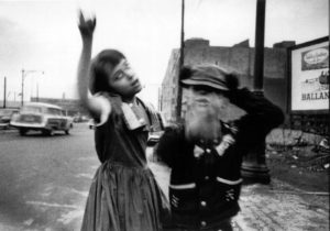
Dance in Brooklyn 1955 © William Klein

I came across the work of William Klein when browsing though photography books in a book shop.  It didn’t take many turns of the pages for me to decide to buy the book (Photofile, Thomas & Hudson) and learn more about the man and his photography.  I found his raw, ironic, high contrast and grainy street photography vibrant, often strange and compelling.

The anti-photograph

William Klein came to the notice of the world in the 1960s after he was talent spotted by the art director of Vogue who saw an exhibition of his early abstract work and offered him a job on the spot.  Klein had studied painting in Paris but was untrained as a photographer and considered himself an an outsider – lacking any respect for the photographic technique he didn’t possess.  In later years he ascribed this to a contrarian instinct: “Having little technical background, I became a photographer. Adopting a machine, I do my utmost to make it malfunction. For me, to make a photograph is to make an anti-photograph.”

Fashion photography is traditionally highly polished, and his untutored, highly dynamic and ironic approach was revolutionary.  Vogue subsequently financed a street photography project in New York where Klein, encountering culture shock after his time in Paris – which he feared would soon wear off – went “in search of the rawest snapshot, the zero degree of photography”.  To get there he employed “A technique of no taboos: blur, grain, contrast, cockeyed framing, accidents, whatever happens…” and adopted the role of  “a make-believe ethnographer”.

Life is good…

The resulting book ‘Life is Good and Good For You in New York’ (1955)  became a prize winning route to celebrity, though no American publisher was willing to publish it (and didn’t for 40 years), considering it unflattering to the point of being anti-American.  Instead it was first published in Paris, Klein’s adopted home.  He followed up with books on Rome, Moscow and Tokyo all in the same inimitable, rebellious style.   Despite his success he became restless and turned to film making.  His first film was Broadway by Jazz, described here in an article in the Financial Times in 2012:

Broadway by Light is often described as the “first pop film”, and to watch it now is still an exhilarating 11-minute roller-coaster ride through the neon of Broadway and Times Square. Klein invented his own kind of visual jazz – violent, vulgar, seductive and beautiful, with a soundtrack to match. The camera moves ceaselessly in and out of the alphabet of signs as the bulbs bloom and fade into abstract blobs of pure colour: Coca-Cola, Budweiser, Rock Hudson, The New York Times. Fascination. Continuous till 4am. Orson Welles said it was the first film in which “colour was necessary”.

Klein only returned to photography in the 1980s, where his pioneering role was recognised.  Since then he has won many more awards and become known for his graphic design work, which applies bold slashes of paint to the enlarged contact sheets he had marked up in pencil years before.

The Street style of William Klein

In his street photography William Klein likes to get into the thick of things; filling the frame with the chaos of the city.  He mixes and moves with his subjects, embracing a wide lens for close up shots and motion blur in a way no one has before.  As he said: “sometimes, I’d take shots without aiming, just to see what happened, I’d rush into crowds – bang! bang! I liked the idea of luck and taking a chance. Other times I’d frame a composition I saw and plant myself somewhere, longing for some accident to happen.”  An article in the  Independent in 1998 sums up his approach:

In Klein’s New York people press themselves up against the lens, dancing around the photographer, pulling faces, pretending to shoot each other, or the photographer, with toy guns. It is the kind of photography that is impossible to do today: people are no longer delighted to be snapped in the street, do not dance or horse around in Harlem on Easter Sunday for a photographer. They were intrigued by this white guy with his beautiful French wife.

William Klein
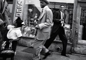
“Moves + Pepsi”, Harlem © William Klein

His preference for the wide angle lens came from the “contradictions and confusion” that it revealed, and enabled him to include many subjects in his innovative composition.  Of the blur he said: “If you look carefully at life, you see blur. Shake your hand. Blur is part of life“.   His prints use extreme contrast and grain complete the visceral effect.  The combined effect is perfect for street photography, as this post in Streethunters from 2015 describes:

Perfection. We all strive for it when it comes to photography. Perfect exposure. Composition. Tack-sharp images. But, street photography isn’t about perfection. At it’s core, street photography is about capturing life. And life is far from perfect. William Klein, in his own way, mastered imperfection within street photography and became a trailblazer.

Klein’s maverick work has an immediate impact but is difficult to interpret. This is apparently by design.  In what has become my favourite William Klein quote he said: “My photographs are the fragments of a shapeless cry that tries to say who knows what… What would please me most is to make photographs as incomprehensible as life.”  Or maybe not as, in an interview in 2013, when asked which is the most gratifying medium he chose film on the basis that “people don’t know how to read photographs. There isn’t this dialogue….What you put in a photograph is not always perceived by the other people who look at them as what you wanted to say. There isn’t a culture of photography. You learn about music appreciation at schools or go to museums, but I found that generally people don’t study photography. There are a lot of things that can be said in photographs but people don’t relate to them.”

Many photographers have been inspired as much by his attitude as his photographs, which is why you will see so many William Klein quotes in posts and articles about his life and work.  More artist than photojournalist, his lack of respect for the established order, his raw technique and the way he interacts with his subjects make him  one of photography’s great sources of inspiration.

Shooting Las Vegas

Gambling Las VegasOrigins

Las Vegas is undoubtedly one of the stranger places in the USA.   Its sheer scale, the juxtaposition of replicas of famous landmarks, the relentless 24 hour gambling and the fantasy element of the place all contribute to that strangeness.  It is also hard for me to get over it’s origins, summarised here by history.com:

A desert metropolis built on gambling, vice and other forms of entertainment…the city was founded by ranchers and railroad workers but quickly found that its greatest asset was not its springs but its casinos. Las Vegas’s embrace of Old West-style freedoms—gambling and prostitution—provided a perfect home for East Coast organized crime. Beginning in the 1940s, money from drugs and racketeering built casinos and was laundered within them. Visitors came to partake in what the casinos offered: low-cost luxury and the thrill of fantasies fulfilled.

The chain of events that led to Mafia involvement in the development of the city is straightforward enough. The state of Nevada legalized gambling in 1931, but no one paid attention until after World War II, when the Mafia, in the form of Meyer Lansky and Bugsy Siegel, saw business potential.   Siegel opened the showcase 105 room Flamingo Hotel and Casino in December 1946 and whilst he paid the ultimate price for skimming from Mafia operations the Flamingo was successful under Lansky and other crime families moved in.  Properties such as the 1,000 room Stardust, the Desert Inn, and the Riviera followed.   In 1959 the Revolution in Cuba removed President Batista, who had been in league with Lansky, and with him the gambling concessions he had made to the mafia.  It also made Havana a no go destination for many high rollers who re-routed to Las Vegas, accelerating its development.     Today a significant proportion of the largest hotels in the world are on situated the Strip.

Downtown

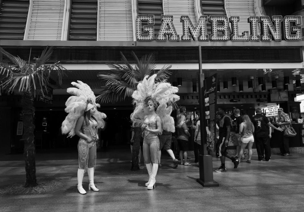
Downtown Las Vegas, the original site of the town and gambling district of Las Vegas, centres on Fremont Street.  It has had significant investment of late but still appears to be the poor relation to The Strip, or offers a more vintage experience, depending on your perspective.  On one trip I had breakfast with a fellow photographer before heading out to Fremont Street and we discussed our approaches to photography.  Fred is an out-and-out street photographer; his interest is in people, pure and simple and he has a practised technique to get in close and yet not be noticed.  I work differently as I am very interested in the relationship between the background and people in the frame.  I suppose that makes me more of a travel photographer; I want to capture something of the spirit of place wherever I am at the time.  In the shot here I wanted to combine the large ‘Gambling’ sign with the women dressed as show girls. For this shot I used a circular polariser, which required an ISO setting of 2,500 for f8, but the boost in contrast was worth it.  The noise the Leica Q produces is relatively filmic and if it appears excessive I apply Topaz DeNoise.   The other shots from my various trips to the desert metropolis are in the Las Vegas gallery.

The Leica Q – A Game Changing Camera

Objects, Deal MarketInspiration

When a friend of mine purchased a Sony RX1  in 2016 I thought it was way to much to spend on a compact camera.  At £2,700 this was no trivial purchase and so I looked closely at cheaper options: the Fujifilm X100T and Olympus OMD 5 Mk II.  Both of these cameras have retro looks and plenty of external controls, which personally I prefer and were far less expensive than the Sony.  The Leica Q was not on my list.

 Temptation

Then I read started to read reviews of the Leica Q.  Pocket-Lint described it as “the best fixed-lens full-frame compact ever made” but it was Craig Mod‘s blog that really got me thinking.  It was a six month field test in Asia and was one of the positive and compelling reviews I have ever read of a camera.

“Make no mistake: The Q is a surgical, professional machine. It pairs best-of-class modern technology (superb autofocus, an astounding electronic view finder, workable isos up to and beyond 10,000, a fast processor, beefy sensor) with a minimalist interface packed into a small body, all swaddled in the iconic industrial design for which Leica has become famous. The result is one of the least obtrusive, most single-minded image-capturing devices I’ve laid hands on.”

“If the gf1 so many years ago set in motion an entirely new genre of camera with micro four-thirds, the Q epitomizes it. If the iPhone is the perfect every person’s mirrorless, then the Q is some specialist miracle. It should not exist. It is one of those unicorn-like consumer products that so nails nearly every aspect of its being — from industrial to software design, from interface to output — that you can’t help but wonder how it clawed its way from the r&d lab. Out of the meetings. Away from the committees. How did it manage to maintain such clarity in its point of view?”

I believe that in hindsight… the Leica Q will be seen as one of the greatest fixed-prime-lens travel photography kits of all time.”

After reading that review I realised I wanted a Leica Q quite badly – but at close to £3,000 could I justify the purchase?

A demanding specification

Thinking through what I really wanted out of a large sensor compact I came up with a fairly demanding specification:

  1. Large sensor (full frame if possible, but no smaller than APS-C)
  2. Silent shutter operation
  3. Usable at high ISO
  4. A sharp, fast lens preferably with image stabilisation
  5. Fast autofocus
  6. Effective viewfinder
  7. Good handling/ergonomics
  8. Durable magnesium alloy construction
  9. Weather proof
  10. Good battery life
  11. Decent burst performance
  12. Value for money

The Leica Q has all this nailed except for weather sealing.  That said, Craig Mod’s review indicated it was pretty tough:

“Over these last six months, the Q joined me while on assignment in South Korea, trekking across Myanmar, hiking the mountains of Shikoku, and spending a few freezing nights on Mt. Kōya. It was used in searing heat, 100% humidity, covered in sweat amid rice fields beneath a relentless sun….  The Q is small but substantial. Solid. It becomes an effortless all-day companion. Strapped across my chest, it was banged sideways against rocks, motorcycles, stone walls, metal water bottles, farmers, cats.  It captured everything thrown at it and into it.”

Purchasing The Leica Q

I attended the Photography Show and after testing some of Nikon’s newest gear, went to the Leica stand to see if I could get my hands on one.  There was one to hand and it didn’t take me long to decide that I really wanted one.  The lens was astonishingly sharp, the build quality was rock solid and the camera was a joy to handle.  The good people at Leica told me that the London Camera Company had six Qs on their stand to sell at the show, so I went and promptly bought one – the alternative being a lengthy waiting list.  I wondered whether I would suffer buyer’s remorse afterwards – at £2,900 the Q is by far the most expensive camera purchase I had ever made.

Leica Q Folkestone HarbourQ Results

My experience with the Q, and its successor the Q2, has really been an extension of my first touch of the camera – it is a delight to use.  It took me quite a while to get over how sharp the f1.7 lens is – I believe it is the sharpest lens I own.  What I also found is that the camera can be remote controlled from my iPhone, which has permitted some street shots that I would not have got otherwise and that I could compose in high contrast black and white whilst simultaneously shooting in raw. 

The shot of the boats in Folkestone harbour is straight from the camera.  The image at top is of some objects for sale in Deal Market as was shot at f1.7 focusing on the statuette at the back of the table and shows the almost 3D effect a fast, very sharp lens can produce.  Here is my summary of how the Q met my requirements:

  • Value for money – Leica’s 28mm f/1.4  retails at £3,900 with the  f/2 costing £2,700.  £2,900 for a full frame camera plus an f1.7 lens suddenly seems quite reasonable
  • Fast burst performance –  10 fps burst
  • Good battery life – 300 shots (Leica/CIPA tests) which is decent
  • Weather proof – sadly the Leica Q is not weather sealed
  • Durable magnesium alloy construction – a milled aluminium top and base plates and a magnesium alloy body provide an unrivalled quality feel
  • Good handling/ergonomics – The camera is built in Germany, the home of the Leica M.   There is a good thumb grip on the back, and the optional grip is excellent.  The controls are well laid out with an excellent tactile feel to them.
  • Effective viewfinder – The Q’s viewfinder is electronic rather than optical, but it does a pretty good job of mimicking an the optical EVF with its high resolution EVF, which at (3.68 megapixel resolution is the highest currently available.
  • Fast autofocus – The Leica Q is the first full-frame Leica to incorporate an autofocus system. It has a 49-point system with multi, 1-point, tracking, face-detection and touch AF.  
  • A sharp, fast lens preferably with image stabilisation – f1.7, 5 axis stabilisation
  • Usable at high ISO – up to 6,400 in my estimation with film like grain
  • Silent shutter operation – leaf shutter for close to silent operation (1/2000s)  
  • Large sensor – 24 megapixel full frame  sensor with no optical low-pass filter for improved  detail and tone mapping

And here are some of the extra’s I didn’t expect.

  • Remote control from iPhone via the Leica Q App
  • Rapid transfer of images of to iPhone via the Leica Q App
  • Ability to shoot wide open in bright conditions due to the electronic shutter (1/16000s)
  • Excellent monochrome setting, which allows high contrast mono JPEGS to be captured along with full colour RAW images
  • The Outstanding macro mode with 17cm minimum focus distance, activated from the control ring on the lens.  The distance markings on the lens change to a new set of macro markings in a way that really exemplifies engineering excellence.
  • The aperture is controlled by a ring situated at the front of the lens (as with any M lens) and is astonishingly pleasing to handle and use
  • Excellent bokeh, especially for a relatively wide angle lens
  • The lens hood is incredibly solid and attractive – it is similar to the M’s Summarit 35mm

For a compact camera the Leica Q is quite substantial – it is not, by any means a pocket camera at 130 x 80 x 93mm and 640g.  The purchase price is the same, but more so – it is very substantial!  However, it is the best camera I have ever owned, and for me, an important step forward in camera development.  I am shooting more and shooting differently – in street photography the 28mm makes you get in close (like Robert Capa and William Klein) and that means I am shooting better with the Leica Q and that is worth a lot to me.

Postscript – The Q2 and Back to Film

My Q was stolen in London – somehow thieves hooked the camera bag out from under the table where I had put it in a London pub.  I I was sad about it as it had been all over the world with me – as described in Around the World With a Leica Q.   The upside is the Q2 had just become available and I upgraded, giving me both weather proofing and the ability to crop in a little more, because of the larger sensor.

During lockdown I got back into film photography. I wasn’t sure about rangefinders so I started out with a low cost option – a Yashica GSN, which is a great way to get started. Finding that I got on with the Yashica well, I saved for a M6 TTL which I have enjoyed shooting with ever since. I have not switched from Nikon for a removable lens system as the cost of the many lenses I use is prohibitive, so the Q2 is the only digital Leica I own, but for street, travel and general purpose photography it remains my go to camera. so is the Leica worth it? With the built in Summilux the Q2 offers, I say it is.

The Streets of Old Havana

Che Mural, CubaOld Havana is everything it is reputed to be and more.  Travelling to the city from the airport on back roads, it felt like I had travelled into an era 50 years on from the apocalypse – with everything in a state of decay and recycling a major part of life.  Old Havana, with its faded and crumbling colonial architecture and many ’50s American cars, is more of the same, and the feeling of being somewhere utterly different is reinforced by the suffocating heat, the noise and the slightly intimidating street life.

I spent five days with Ramses Batista – www.ramseshb.com, a professional Cuban photographer.  We shot mainly on the streets of the city, but also drove around other parts of Havana and out to Cojimar and Soroa in Pinar del Rio.  Ramses was a wonderful tutor and compañero and I was really happy with the shots I brought back with me.   We spent a lot of time setting up street shots – something Ramses excels at.  One of my favourites is shown here – Ramses told me about the Che mural, which was just around the corner from my hotel, the excellent Saratoga, and we flagged down a suitable vehicle for the shot – which shows the driver walking back to his car.   I’ve used a lot of contrast and brought out as much of the structure of the road, building and car as I could.  The mono conversion plugin Silver Effex allows the placement of selective control points, which can be used like spot lights, so I lit the wheels and the pillar slightly as as they were a little too dark without a bit of extra lighting.  As to what the white substance on the road is, I have no idea, but it all adds to the tone and texture.

I’ll describe one anecdote from the trip that highlights how different Cuba is: Ramses and I went out to Colon cemetery to shoot Angels (entities which are well represented on this site at the angels gallery).   As we drove towards the gates on our way out a security guard stopped us and searched the boot.  I asked Ramses why this was necessary  and he told me that the guard was searching for human bones, which are much prized for use in ceremonies in some of the syncretic religions of Cuba…

My Nikon D600 was reliable but suffers from a sensor that is astonishingly sensitive to moisture and dirt, so I spent a lot of time cleaning up spots from the images whilst editing them.  I also took a trip over to my friends at T4 Cameras in Witney for yet another sensor clean.  I was in similarly poor shape as I managed to put my back out travelling in the jungle in some rather dilapidated car seats (I felt we had to take a 50s car for the trip) and I picked up a nasty bug from the same locale – but it was most definitely worth it.  I want to go back and see the rest of the island as soon as I can.