Saul Leiter – An Unfinished World
I have long enjoyed the photography of Saul Leiter and my admiration for his work was increased by visiting the “Saul Leiter: An Unfinished World” exhibition at MK Gallery, curated by Anne Morin.
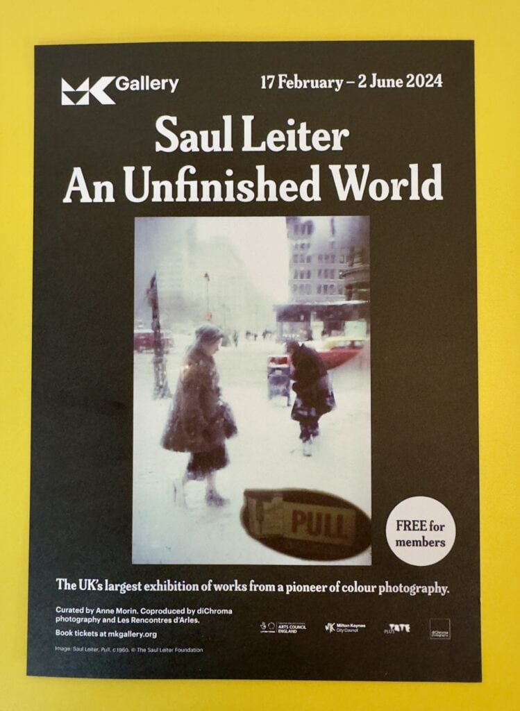
This exhibition mixes Saul Leiter’s colour and black and white photographs, paintings and commercial fashion photography. There is a comprehensive chronology printed on the wall but the exhibition “encourages encourages viewers to find their own relationships and paths through Leiter’s unfinished world.” Given Leiter’s work and the world-view that underpins it, this approach makes a lot of sense.
The title is equally apposite and befits a collection of ‘tiny fragments of an unfinished world’. This was his world view, “little pieces of images juxtaposed and conjoined, to form ever-expanding fields.”
Many of Leiter’s pithy quotes adorn the walls, which I found both helpful and inspiring. All in all, it is a fine and very worthwhile exhibition. A review in the Guardian called it a “glorious survey of an impressionist with a camera.” I completely agree with that assessment, but the exhibition unlocked something I didn’t expect – an encounter with the person behind the lens. To my great surprise I found Saul Leiter the person as inspiring as his work.
The Photography of Saul Leiter
Saul Leiter had no formal training in photography, but the genius of his work was recognised by the influential Edward Steichen, who included it in two important MoMA shows in the 1950s.
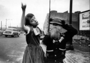
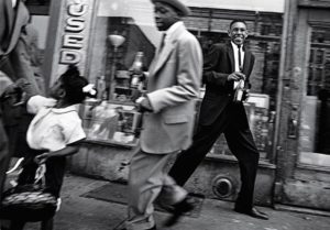
Leiter’s work is characterised by abstract form and bold composition. He did a great deal of very fine black and white work which makes much use of much shadow and blur, and I enjoyed it greatly. However, it is his colour slide photography that has had most impact on me.
I like it when one is not certain of what one sees. When we do not know why we are looking at it, all of a sudden, we discover something that we start seeing. I like this confusion.
The experience Leiter describes here is often that of the viewer of his photography. There are large expanses of negative space, sometimes enveloping a detail; abstract lines that resemble brush strokes; reflections, fogged glass; fog; shadows and silhouettes. Much of street photography has a documentary feel but Leiter’s takes it to another more abstract, impressionist dimension.
He often makes use of steamed up windows for their abstracting quality, uses snow as a flat white backdrop and blurs foreground objects . He sometimes used expired colour film, which could produce surprise colour shifts.
Street photography depends greatly upon chance encounters, but as the Guardian review of the exhibition noted, “He finds chance and arbitrariness because he is looking for these things, and uses all his artistry to bring them out.”
He has other recurring themes. In addition to the inclement weather, translucent materials and properties of light that help him him gently smear his palette he regularly returns to cars, buses, hats and famously, umbrellas.
Painterly Parallels
His work is painterly, with fans and critics seeing parallels to the work of great artists like Edward Hopper, Piet Mondrian and Mark Rothko. The parallel with Hopper strikes a chord with me. I have seen some of Hoppers’ work, most notably, Nighthawks, in The Art Institute of Chicago. There are similarities in both the colour palette and the emotional undercurrent, though it occurs to me that Leiter’s urban experience is more about introversion than the isolation Hopper is known for.
Art critic Roberta Smith wrote in 2005: “Mr. Leiter was a photographer less of people than of perception itself. His painter’s instincts served him well in his emphasis on surface, spatial ambiguity and a lush, carefully calibrated palette.”
Harlem, 1960
One of the photographs that impressed me the most at the exhibition was one of his most famous photographs: Harlem, 1960. There is great description of the image in The arts desk: “A black man in a panama hat and beige jacket smokes a cigarette as he walks under the black awning outside a bar. There’s nothing to this chance encounter with a passer-by, except for an amazing synchronicity of colour. The man’s beige jacket matches the lettering on the awning announcing HOUSE, while his tie matches the red cab of the lorry parked behind him and the lettering on the vehicle advertising Walker’s Gin. A man in a black coat walking the other way frames the left side of the picture while a black dustbin frames the right side. The coup de grâce is the beige and red sign overhead that reads BAR and completes the colour composition.
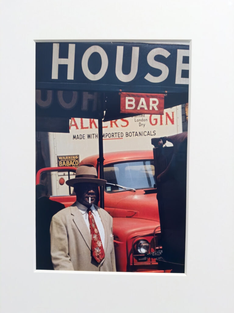
If this were a painting by Whistler, the image might be called Harmony in Beige, White, Red and Black and it would have been artfully contrived. Leiter’s photograph, on the other hand, was completely unplanned. “I’ve never had a system or a project,” he insisted. “I don’t go out looking for things. I wander around with my camera, like a flâneur.” The paradox is that he responded to “unimportant things” spotted en passant, yet the viewer often has to spend time unravelling this split second of information.“
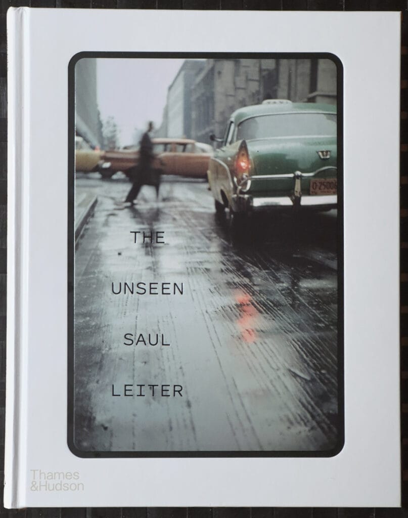
The Unseen Saul Leiter
Much of his colour work was taken on slides. This enabled Leiter to project his photographs on the walls of his apartment, which was important to him as he couldn’t afford to have prints made at the time.
The MK Gallery bookshop had a copy of The Unseen Saul Leiter, which is a book of 76 Colour slides with several chapters of commentary. Most of the slides are Kodachrome, but some are Anscochrome or Ektachrome. The images were taken mostly in the years 1948 to 1966, Saul’s first two decades of living and photographing in New York.
The book is important as, until it was published, the majority of Leiter’s images known to the public were those published in Early Colour, which largely introduced his extraordinary talent.
The origins of The Unseen book were an academic project. In 2017 the German scholar Elena Skarke approached the Saul Leiter Foundation because she wanted to write her dissertation on his work. She visited his studio (now the foundation’s headquarters) and decided to focus on the colour transparencies for her research.
The Unrecognised Pioneer of Colour
Saul Leiter was a pioneer in the use of colour photography. In the 1940s, when black and white photography was the norm for serious work he embraced colour, which he used in a completely unique way, often using a 150 mm telephoto lens in his colour street photography, the compressed view contributing to provided the painterly feel.
Colour Photography in the 1940s
At that time colour photography was the realm of ads and amateurs. Walker Evans, the famed documentary photographer of the great depression called colour photography “vulgar,” and he was far from alone in this sentiment.
One day I bought a roll of colour film and I took pictures. Then I got a small box with slides. I liked what I saw. I liked colour even though many photographers looked down on colour or felt it was superficial or shallow. – Saul Leiter
Colour Photography in the 1970s
The recognised pioneers of colour photography were William Eggleston, Helen Levitt and Stephen Shore, who gained recognition much earlier than Saul Leiter, becoming famous advocates for the medium in the 1970s. Sadly, Leiter barely made a footnote at that time.
For many years William Eggleston was recognised as the first photographer to use colour as a defining artistic choice. Happily that that view is fading and Leiter is getting the recognition he deserves – along with a better sense of perspective. After all, Alfred Stieglitz made and exhibited colour photographs using the Autochrome process in 1909.
Whilst I respect the work of all of those photographers, it has not had the same impact on me as Saul Leiter’s. He is in that very small group of photographers for me whose work is arresting in the true sense of the word – it stops you in your tracks. A few of those photographers have articles of their own on this site, including Cindy Sherman, Vivian Meyer, William Klein, Fan Ho and Brassaï.
Perhaps being left alone in relative obscurity helped him develop his unique and introspective world view. Geoff Dyer, in a review of his work in the Telegraph asked what it meant to be an ignored artist and asserted that “For Leiter – left alone to his colourful craft – it was the making of a master lensman.”
Zen Saul
Leiter was a thoughtful man with diverse influences. His library consisted of thousands of books and he was influenced by Japanese woodblocks and ink paintings as well as impressionist and post-impressionist painters.
During the research I conducted after the exhibition I came across an article by freelance photographer Belinda Jiao entitled Saul Leiter Street Photography Analysis: Techniques, Influences, Philosophy which shed more light on the influence of Japanese culture.
Love of Japan
I learned that he loved all things Japanese, which is a passion I share with him. The Ten Days In Japan I had in 2015 were wonderful. Belinda provides an illuminating quote from Pauline Vermare, the curator of the exhibition Photographer Saul Leiter: A Retrospective: there were etchings of paintings by Koryusai hung on his wall; among the heaps of collected items were Japanese calligraphy papers, vinyl records of Japanese musicals, and a massive library of books dedicated to Japanese literature, poetry, ceramics, ukiyo-e and Zen.
The same article describes the strong parallels between Leiter’s work and Zen Buddhism, which celebrates the living in the moment yet without attachment to earthly pleasures. It is also a shared characteristic also commonly found in Japanese ukiyo-e (translates into ‘Pictures of the Floating World’) prints, which has a strong emphasis on depicting the here-and-now, the banal fragments of being human.
The article also pointed out the correlation between Leiter’s choice of subject matter and those that feature regularly in ukiyo-e art – everyday life objects and elements of weather.
Although Leiter rejected the notion that he had a philosophy at all, the more you examine his work and its influences the more you appreciate his depth.
I don’t have a philosophy. I have a camera.
Increasingly, I wonder if that quote is accurate, or whether it is just a reflection of Leiter’s lack of ego.
The Prophets – Impressionism & Les Nabis
Saul Leiter’s biggest influences in the art world were the post-impressionist artists Pierre Bonnard and Édouard Vuillard, who were both members of ‘Les Nabis’, which means ‘the prophets’ in Hebrew. This was a movement that embraced bold colours, flattened and abnormal perspectives, combining late-Impressionism’s focus on light, Japanese-influenced lines, and Paul Gauguin’s striking use of colour.
The Cameras of Saul Leiter
It seems almost wrong to concern ourselves with the more mechanical aspect of his work, but to translate East Village light into the magic of his images Saul Leiter needed optics.
Leiter experimented with colour photography used slide film such as Kodachrome; he also enjoyed using expired film stock with its surprising and odd shifts in colour and his unusual perspectives often come from the use of telephoto lens. These are probably the most salient technical factors in his work. The cameras themselves tell us less, but I am always curious about which makes and models the great photographers used. We learn this from these entries in the timeline from the Unfinished World Exhibition:
1939 c. Is given a Detrola camera by his mother.
1948 Begins working with colour slide film. Works primarily with: Argus C3, Auto Granflex Junior, Leica and an early Rolleiflex.
1960-80 – Continues to do fashion photography which is published in Harper’s Bazaar, Elle, Show, Vogue (UK), Queen and Nova. Photographs are also included in Life, US Camera, Photography Annual and Infinity. Travels to Mexico, France, Italy and Israel. Often uses a Leica M4 for commercial work in the 1970s and after; for street photography uses Leica CL, Minox 35EL and Canon A-1 and AE-1, among others.
2003 – Receives a grant of $10,000 from Olympus along with his first digital camera, an Olympus E-1. Proceeds to purchase many digital cameras including Leica and Lumix models.
By 2005 Leiter had taken his last shot on film, ending a sixty-year relationship and turned full time to digital photography, which he embraced with great enthusiasm.
Painting
Saul Leiter painted daily from his mid teens years until his death. In his formative years abstract expressionism was large and expansive, but Leiter’s paintings, which are most water-colours, are much smaller in scale. I found them interesting but they didn’t move me in the way his photography does.
His friend, the painter Franz Kline, once said to him: ‘If only you painted big, you’d be one of the boys.
Early Life
Saul Leiter (1923–2013) was born into an Orthodox Jewish family, Leiter set out to become a Rabbi like his father but in 1946 he defied this family’s expectations and abandoned his studies. His interest in art led him to move to New York City in 1946, where he pursued painting and photography. His mother had given him a Detrola camera as a child, not knowing the instrument would help reshape his life
I got fed up with the whole religious world and all the preoccupations with purity and nobility and observance—I wanted to be free of those things.
In those formative years, eminent photojournalist W. Eugene Smith and abstract expressionist artist Richard Pousette-Dart (founder of the New York School of painting) encouraged Saul to pursue photography. It was through his friendship with Pousette-Dart that he recognised the creative potential of photography.
Fashion Photographer
His friends encouraged him to take up photography as a way to earn a living and he became a successful fashion photographer, with commissions for Harper’s Bazaar, Vogue and Elle. Leiter’s fashion photography paralleled his personal work, imbued with his unique style – he photographed models soft-focused or behind glass.
I started out as a fashion photographer. One cannot say that I was successful but there was enough work to keep me busy. I collaborated with Harper’s Bazaar and other magazines. I had work and I made a living. At the same time, I took my own photographs.
He preferred shooting in his home neighbourhood of New York’s East Village, where the vibrancy of the streets provided all he needed.
I take photographs in my neighbourhood. I think that mysterious things happen in familiar places. We don’t always need to run to the other end of the world.
Leiter never for self promotion or networking, and with little work and debts mounting in 1980s, he was forced to sell his Fifth Avenue studio. He continued his personal work from his East Village apartment, which he shared with artist Soames Bantry, his longtime partner who often sat for his photographs and paintings, and who died in 2002.
Recognition and The New York School
Although Edward Steichen exhibited some of Saul Leiter’s colour photographs at the Museum of Modern Art in 1953, for forty years afterwards they remained virtually unknown to the art world.
The concept of the ‘New York street photographer’ was born at the same time Leiter started working in the late-1940s. But Leiter wasn’t swept along by its momentum. He was not a conventional street photographer. He lacked the bleakness of Robert Frank or the knowing irony of William Klein which helped propel the popularity of their work and that label.
Saul Leiter may have faded entirely into obscurity if it weren’t for Richard Avedon, who, in 1992, recommended that his work should be included in the book The New York School: Photographs, 1936–1963. This led to other books and exhibitions.
Except for his inner circle, few saw Leiter’s personal colour work until towards the end of his life. Saul Leiter: Early Colour, a book of street photographs, was published to great acclaim in 2006 only a few years before his death in 2013. The instant success of Early Colour transformed Leiter’s life. His precarious finances improved with the increased print sales that followed the book.
The majority of his work, however was left unprinted, with tens of thousands of negatives and slides stored in boxes at his home.
Outlook
It strikes me that Saul Leiter’s outlook on life was deep but bright. He was introspective and contemplative but also cheerful. This is reflected in his photography, which often captures magic in the everyday. He saw what others didn’t and was upbeat where others weren’t. Though I never met the man, I feel an attachment to him that goes beyond his work.
It is not where it is or what it is that matters but how you see it
I see this world simply. It is a source of endless delight
A photographer’s gift to the viewer is sometimes beauty in the overlooked ordinary
Photography is about finding things. And painting is different, it’s about making something
Afterword
While I am a photographer who works mainly in black and white I do use colour occasionally. If I am going to produce a colour image I prefer to use film and I have a great affection for the tones of Kodak Portra. Since the light of my encounter with Saul Leiter and his artistry I intend to review my colour work and see where that takes me.
 The Chrysler Building in New York is a favourite of mine, and a great subject for black and white photography. The metallic exterior, the sunburst on the crown and the metal eagles make it an architectural wonder for me.